It is known that through color we can define not only a specific atmosphere but a state of mind. As sound and light, the color can have a relaxing, energizing effect or contrary. When it comes to decorating, choosing paint color can really be a challenge and it’s good to take time to decide.
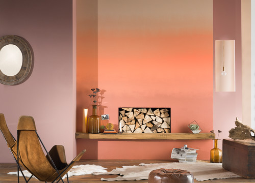
Photo by Dulux Amazing Space – More living room ideas
It’s easy to adjust your paint colors, let’s say, to curtains or a piece of furniture, but hold off making final choices until you’ve developed an overall room scheme. All the things in our room add together to a palette of materials and colors. Paint is available in an infinite array of colors and because there are so many choices we do not know how to start. We need to find the right one.
After all the way new paint colors will look, will set the tone for the room and it depend a lot on the styling of your house. To determine a dominant color in a room, it is important to define what style you want to give it: rather classic, loaded, clean, pastel colors or more supported? If we are unsure, we do not have to go in colors too vivid for fear of regret and really, really we have to study the colors.
We will find clues about the underlying tones of different shades of a color on a full sample strip of coordinated colors. There are thousands of paint colors, but not all of them are good. Some are good for small accents or artificial light only, and maybe others were just added to make a fun look.
In fact, the good colors are the ones with the right tonality and undertones. What is an undertone? An undertone is when another color seems to shine through the color applied. An undertone make a color to be nicer and lively but attention: an undertone can be a wrong color, too cold or too dirty.
It’s a good idea to use the color stripes to find the right one. It is the same with light and dark colors. Tonal value, light and darkness is just as important, than having the right colors. Tip: We can check tonal value by looking at the room through our eyelashes.
The result we will see everything in a sort of black and white. The best way to get a true view of a paint color is to look at it in many lights. For someone inexperienced it is strange but we have to know that white is not always white.
There are so many nuances of white or beige color. A pinkish, beige (bone) white will be a warm color and a blue white will be, for sure, a cold color. How did I mention, the best way to get a true view of a paint color is to look at it in many lights. Take the paint chip outside to see it in natural light. Look at in under an incandescent and fluorescent light.
Colors are often referred to as “warm” and “cool.” Orange, red, and pink are considered “warm” colors, while blues, greens, and violet are thought to be “cool.” Knowing the theory behind color can help you select the right tone. When the same color is available in tones, we are talking about shades or degraded.
Venetian Stucco – A Decorative Painting Type (howtobuildahouseblog.com)
1. Orientation. It’s important to know that choosing a color depends on the orientation of the room.
- a) North orientation: it means a lack of sunlight. Therefore it is preferable to choose warm colors to make the atmosphere brighter. (yellow, orange).
- b) South orientation: sunny room. It is good to use cooler colors (blue, green, white).
- c) East orientation: a sunny room in the morning. We need more neutral colors (cream, gray).
- d) West orientation: where the sun is setting. Colder or neutrals colors (white, gray)
2. Opened rooms. If we live in an apartment or a house where the rooms are open and communicate with each other, it is important to unify the color in order to maintain continuity and therefore we can use the same color in every room.
Create a subtle harmony between the colors is pretty hard work:
The contrast can give a room a strong personality. A contrast is two opposite colors like: green and red, orange and blue, purple and yellow.
Color balances. It is good to stop at three colors; The dominant color 80%; the second 15%; third 5% The dominant color is the color with the largest proportional area (the ground). Smaller areas are subdominant colors. Accent colors are those with a small relative area, but offer a contrast.
Volumes. The colors influence our perception of volume. If the height of ceiling is low then it is advisable to paint a dark color. It is a good idea to paint a wall a certain color that it will capture the attention. And we don’t have to forget what kind of finish the paint is made. If it is gloss or semi gloss the room feels larger and the ceiling higher.
One of the factors in choosing paint colors is color paint has to match to furniture. Remember, wooden furniture has a tone in sunlight, another tone in a warm electrical light and definitely another tone in a cold white electrical light. Another factor could be color paint o match with the floor. However there are many systems to choose a right color.
One of them could be classic. We can choose a color from a painting or a rug. Also an important thing in choosing the right color is to know is better to have the floor darker than the walls and the ceiling lighter than walls. But sometime maybe is not a bad idea to have the floor lighter where maybe, the ceiling darker.
The size of the room and its use surely affect the paint color. Let’s see again the effect of choosing the right color.
1| Walls and ceiling with dark colors, make the room a more intimate and cozy.
2| Walls and ceiling with light colors, expand the space making it appears larger.
3| Ceiling darker than walls – The ceiling seems lower.
4| Walls painted light only up to about 25 cm from the ceiling – it reinforces the effect of lowering the ceiling, this technique allows you to have good results in a very high ceiling.
5| Darker walls of the ceiling – in this case we have the reverse effect, the ceiling will seem higher.
6| A wall darker than the other – the room will appear longer.
7| A wall brighter – were is an opening in wall, a window
8| Long walls painted in light colors, shorter walls in dark colors – more attractive
9| For a really striking look it’s better to try lighter walls and dark tones or bright color for trim.
Choosing the paint finish for the job is also a challenge. Matte or flat finish hide wall imperfections, but glossier finishes will reflect more light. For a helpful advice, go both online and to your local paint store.
Tell the paint professional about your project and goals for your decorating project. Ask which paint products they recommend, and why. Get information on specialty paints such as low-odor, stain-killing primers, chalkboard paint, washable paint, and many more.
When you think that you’ve really chosen your perfect color, buy a pint of paint to do a test patch. Paint only a square on a board or directly on your wall. Let it dry. Wet paint color often looks different from dry paint.
Look at it during the day, morning, evening, and night. How does it look with the room’s flooring, furniture, and fabric choices? If it isn’t right, get another pint and try again. We like to test three colors at once to save time.
Having some extra white paint, carefully sealed in a container, can never hurt. Use it to lighten some paint that’s too dark. You’ll undoubtedly find the right color. Getting used to a new room color might take a few days. Have some patience and after a while we’ll be pleasantly surprised about the harmony between painting and our stuff.
Good Luck!!


