Color experts and designers often encourage using dampened colors in rooms for rest and relaxation. But what if the living room is not the place you go to unplug? Or maybe it’s simply speed and excitement that makes you forget about the hustle and bustle of everyday life? Colors have an ability to set energies in turn, and the bigger the contrasts, the greater the tension! However, combined with some neutral shades, the living room becomes a perfect place to live.
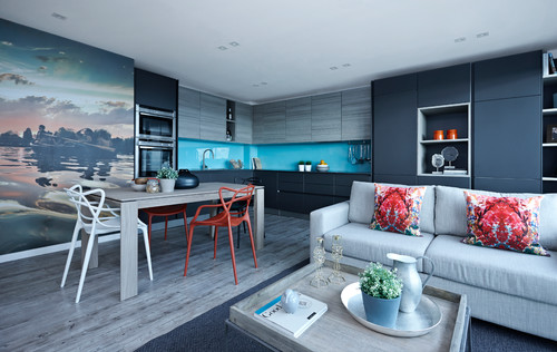
Photo by Bailey London Interior Design & Build – Browse kitchen photos
Complementary Colors
Within the color palette any designer can find the complementary colors. Red and green, blue and orange, yellow and purple are examples of these. If you choose to combine the complementary colors, you will see that they are able to emphasize each other. But to avoid visual war, it’s important to let one of them rule. Here, the interior designer chose green as the dominant color, but made the touch of red and gray stripes create a nice contrast and balance.
Living Room Color Schemes, Inspiring Ideas | Decorating with Colors #16 (video)
Stickers
The walls are painted white. The neutral background gives a great background for the other colors, and serves as a fine canvas for the wall décor.
If you want to give the wall an untraditional and unique décor, stickers are a new, inexpensive and simple decoration idea. The decorative adhesive labels are available in all sizes and shapes and are easily glued to the wall. However, most types of stickers have a stick & peel back, which allows them to be easily removed from the wall, unlike regular stickers, without putting permanent marks.
Bold and Daring Floor Color
Should you completely pull this style out, do not use it with a 3-spoke oak park. Here some elastic green vinyl tiles were chosen. The vinyl tiles have a transparent depth and light reflection that reminiscent of glass and creates a nice illusion in the room.
Vinyl tiles require a completely even surface to lay well. This type of floor gives a rather hard floor, and does not just create a warm and soft atmosphere – but it was not the intention of the room either. To make it a little more comfortable at the feet, the interior designer nevertheless chose to break up the floor surface with a rug.
Colorful details
Even though green has been allowed to play the lead role, green is not the only color in the room. Pink, red, yellow, blue and turquoise have also been added – albeit in small doses. This makes the eye never bored, while the small doses do not make the overall impression tiresome.
In the midst of all the colorings, pure white is also an important element. It sheds down, giving a nice contrast to all the colors. This avoids having a stressful effect, and the living room becomes inviting.
A Living Rooms Gets Character from Modern Art and Colors (howtobuildahouseblog.com)


